One-Click Transfer: The Feature 80% of Users Wanted
How I discovered and validated the #1 most-requested Open Finance feature through comprehensive user research—turning raw data into an intuitive one-tap solution
The Story
Imagine you're trying to move money from your Nubank account to another bank with just one tap. Sounds simple, right? But for 65% of users, the experience was so confusing that they gave up halfway through.
The problem? When users tried to select their destination bank, they saw a long list of every bank in Brazil—even banks they'd never used. It was like trying to find a specific contact in your phone, but instead of your favorites, you see every phone number in the country.
Meanwhile, Mercado Pago (a competitor) had already figured this out. Their experience was smooth, intuitive, and remembered which banks you actually used. We were losing customers and, more importantly, losing their trust.
The Challenge
65% of users were abandoning the transfer process at the bank selection screen. Our UX was inferior to competitor Mercado Pago, and we had an ambitious target: move R$1.8 billion in transfer volume through this feature.
Key Business Context
- 3.5 million potential users affected by poor experience
- Competitor already offering superior experience
- Priority use cases: immediate payments, credit card bills, and credit limit release
- OKR target: R$1.8 billion in transfer volume
My Research Approach
I designed a four-phase research process to understand the problem deeply and validate solutions quickly:
Research Review
Mar 5-10
Gathered insights from previous credit card and account research to identify knowledge gaps and define focus areas.
OUTCOME
Clear understanding of what we already knew and what we needed to discover
User Research
Mar 10-15
Conducted focus groups with 17 users, competitive benchmark against Mercado Pago, and survey with 107 respondents.
OUTCOME
Deep insights into user behavior, pain points, and expectations across segments
Design & Testing
Mar 15-30
Led co-creation sessions, developed high-fidelity prototypes, and conducted usability testing with refinements.
OUTCOME
Validated concepts and prioritized 5 critical features for implementation
Engineering
Apr-May
Collaborated on technical discovery and implementation planning to ensure feasibility of One-Click transfer.
OUTCOME
Clear roadmap with technical specifications and realistic timelines
What Users Actually Told Us
Through 17 focus group participants and 107 survey respondents, we discovered three primary motivations for using one-click transfers:
Payments
60 quotes60%Paying bills, credit card invoices, online purchases, streaming services, and general expenses was the primary motivation.
"To pay bills."
"To pay my credit card invoice."
"For online purchases at Mercado Livre."
Better Conditions
22 quotes22%Users mentioned "better interest rates" and "higher yield" as key motivators for transferring money.
"Better yield in Mercado Pago."
"If it's faster to pay there, I just pull the little bit I have in Nubank."
Primary Account
21 quotes21%Users concentrate their money where their primary financial activity happens.
"I use Mercado Pago a lot."
"I concentrate money there as my movement is higher."
"I bring money as needed. I always transfer the exact amount."
Critical Findings That Changed Everything
Our research identified 5 priority improvements, but three were absolutely critical and needed immediate action:
Eliminate Bank Selection Screen
The Problem:
The biggest drop-off point: 65% of users abandoned the process here
The Solution:
Display only banks users have actually used for self-transfers. Remove the irrelevant list of hundreds of banks.
Why This Matters:
Think of it like your phone's 'recent contacts'—you don't need to see every person in the world, just the people you actually talk to.
What users said:
"Mercado Pago already shows my account balance. These other banks I don't have accounts with don't appear."
Highlight Benefits & Use-Case
The Problem:
Users didn't understand why they should use this feature
The Solution:
Show contextual value propositions: Turbo Savings, Bill Discounts, Nucoin rewards—right at the decision point.
Why This Matters:
People need to know 'what's in it for me' before they take action. We weren't communicating the benefits clearly.
What users said:
"Better yield at Mercado Pago. If it's faster to pay there, I just pull the little bit I have in Nubank."
Clarify Two Steps Only Once
The Problem:
Users were confused and worried about being redirected to external banks
The Solution:
Clearly explain that bank authorization happens only the first time—after that, it's truly one-click.
Why This Matters:
Uncertainty kills conversion. When users don't understand the process, they bail out.
What users said:
"I didn't even notice I could search for a bank. I was curious about the integration, wanted to test the service."
Who We Were Designing For
Not all users are the same. We identified four distinct customer profiles, each with different needs and motivations:
Opportunity Seekers
"I love my roxinho card, it was the first one. But Nu isn't giving me any benefit."
CHARACTERISTICS
- •Emotional bank choices
- •High openness to re-engage
- •Looking for recognition
STRATEGY
High-Value Shifters
"I have 2 accounts: at Nu, I use the credit card, but I leave my money on MP to earn yields."
CHARACTERISTICS
- •Previously heavy Nubank users
- •Shifted to Mercado Pago
- •Benefit-focused
STRATEGY
Consistent Diversifiers
"I choose better options from each institution. One for investment, one for bills, one for purchases."
CHARACTERISTICS
- •Strategic multi-bank users
- •Deliberate distribution
- •Financially organized
STRATEGY
Marketplace Migrators
"I stay in the bank that gives me more discount and benefits. I don't have problems changing my main bank."
CHARACTERISTICS
- •Mercado Livre shoppers
- •Discount-driven
- •Low loyalty
STRATEGY
The Impact
After implementing our research recommendations, the results exceeded expectations:
What This Means in Real Terms
- 3.5 million people can now move money between banks without frustration
- Over 1.2 million users transferred funds with a single tap in the first 3 months
- 65% drop-off reduced to 20%—that\'s 45% more people successfully completing transfers
- Executive team prioritized payment experience improvements based on research findings
- Nubank closed the UX gap with competitor Mercado Pago and exceeded transfer targets
Key Learnings
Small UX changes, massive impact
By fixing just 3 critical pain points, we reduced drop-off by 45% and moved $1.8 billion in transfers.
Listen to what users don't say
Users complained about the bank list, but the real problem was uncertainty and lack of clear benefits.
Competitive benchmarks reveal gaps
Analyzing Mercado Pago's superior experience showed us exactly where we were failing.
Segmentation matters
Different user types needed different motivations—one size does NOT fit all.
Research drives executive decisions
Clear, data-backed findings got immediate buy-in from leadership and fast implementation.
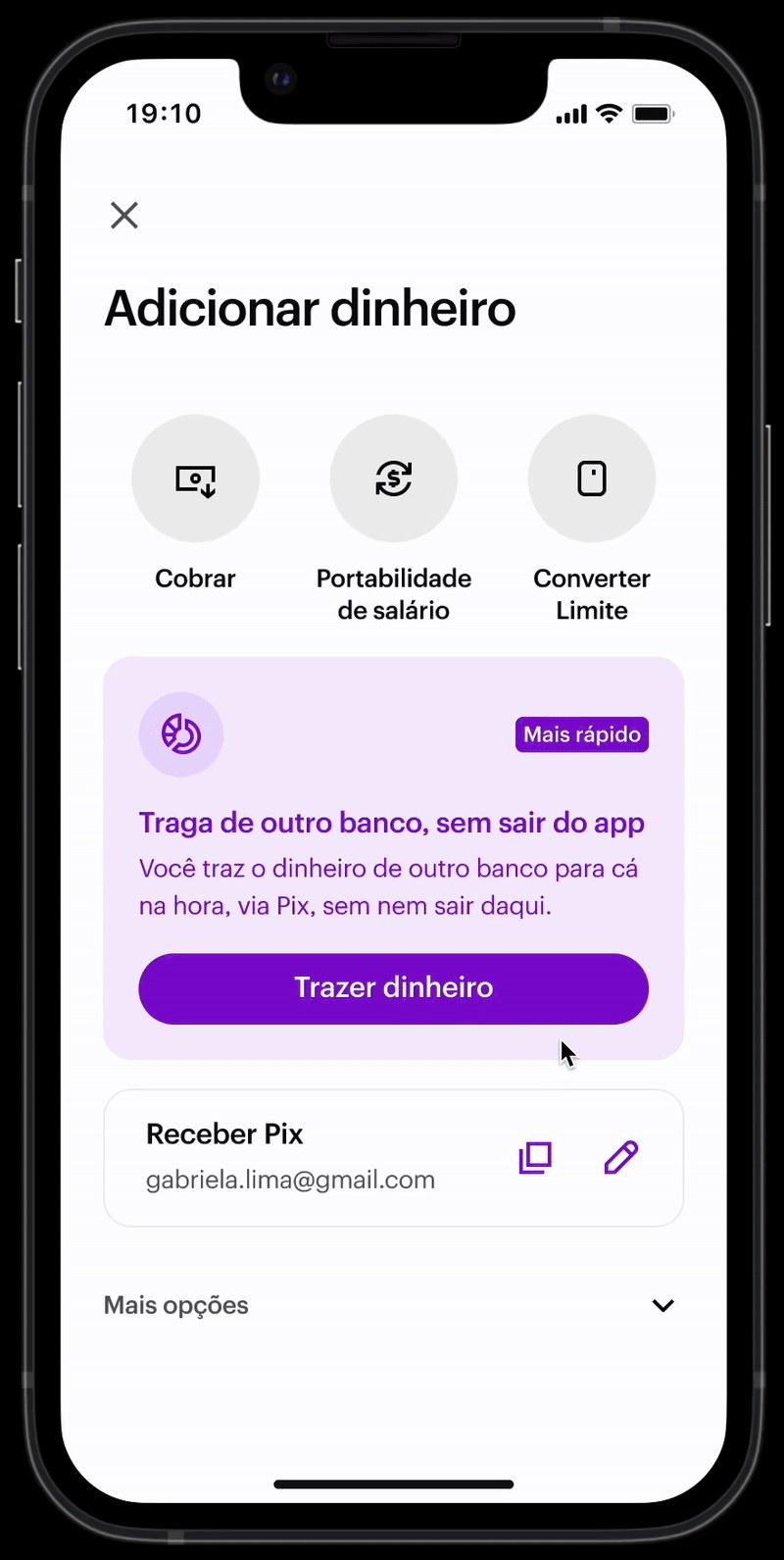
See It In Action
Watch how the one-click transfer feature works in practice